The Brief
Brand Name: Whe Network
Target Audience: Health-conscious women looking to lead a healthy lifestyle, physically, mentally and spiritually, from inside and outside of christianity.
Brand Personality: Modern, clean, feminine and sophisticated with a focus on natural and pure products.
Brand Stands for:
- Healing
- Recovery
- Reconciliation
- Restoration
- Empowerment.
Design Style: The logo should be simple, elegant, and memorable. It should convey a sense of purity, vitality, and overall well-being. The colour palette should include natural but pure, tones, such as blues, and whites, and the design should incorporate natural elements such as leaves, flowers, or other organic shapes. The design should also incorporate some form of ‘spiritual’ imagery to incorporate the wholistic nature of the brands products.
Logo Usage: The logo will be used primarily on packaging, marketing materials, and the company’s website. It should be versatile enough to work in different sizes and formats, including both digital and print media.
Overall, the logo should represent the brand’s commitment to promoting a healthy and balanced lifestyle, while also conveying a sense of quality and professionalism.
Concept Design

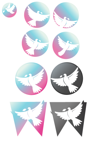
After sketching out a few ideas, the client decided that they wanted for me to head in the direction of a dove icon based logo. Above are some earlier concept examples…
Logo Design
Iconography
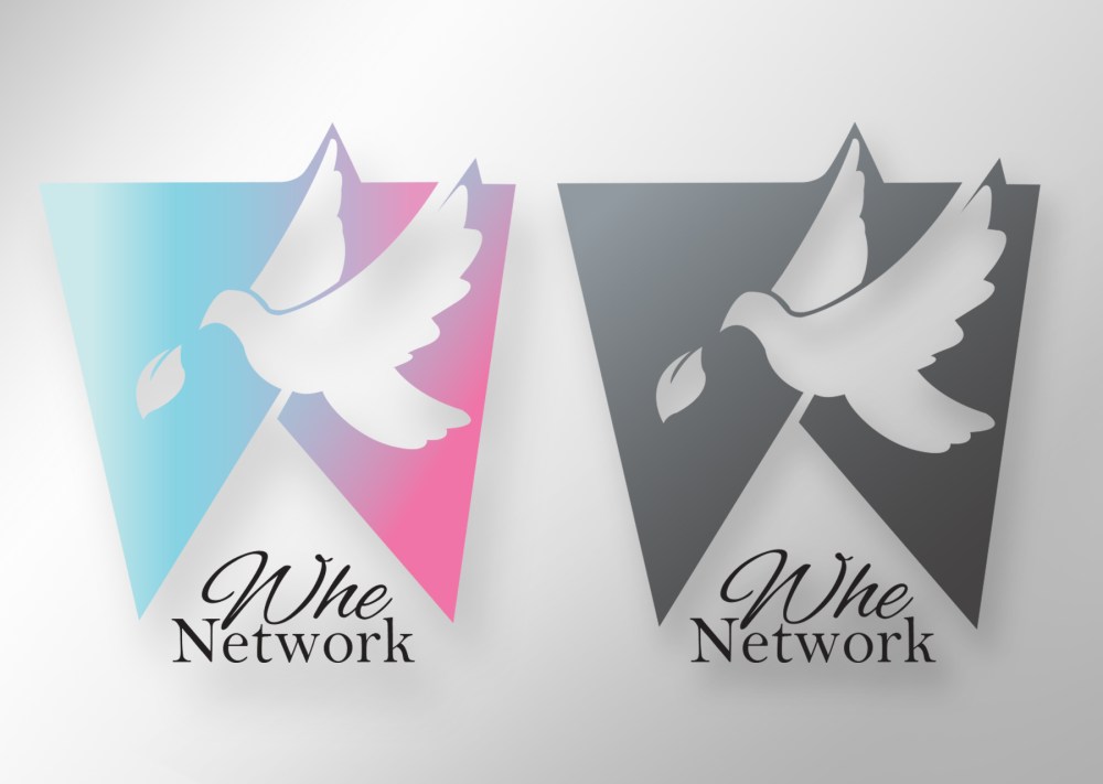
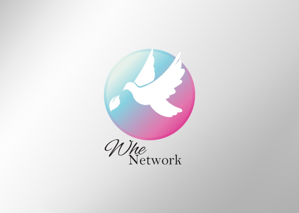
The key aspect of this logo design is the dove, a dove denotes purity, spirituality, freedom and it also has strong ties to Christianity. After a while I started incorporating a leaf, denoting health, life and nature / natural products.
The dove was what Noah sent out of his Ark to find land during the biblical story of the flood, when the Dove found land, it returned to Noah with a leaf, a sign that the flood was now subsiding and that land was out there somewhere. A sign of hope.
Colours
The colours of light blue and a sunset pink were decided on due to the lighter tone that it gave the brand, at the same time it also depicts a dove moving from a more red / ill place to a more pure and well position on the logo itself.