The Brief
Client: Legacy Centre of Excellence
Event: Live at Legacy: The Legendary Twinkle Brothers
Date: 11 April 2020
Target audience: Reggae music lovers, aged 30-60, residing in Birmingham, UK
Design objective: To create a visually striking and dynamic reggae concert flyer that captures the essence of the genre, promotes the event, and appeals to the target audience.
Key elements to include:
- Headliner artist: prominently feature the name and image of the headlining reggae artist, alongside the date and location of the concert.
- Additional performers: include the names and images of other supporting performers.
- Ticket information: clearly communicate ticket prices, purchase options and any other relevant details.
- Design style: incorporate bright, bold, and vibrant colours, along with a stylised, hand-drawn or painted look and feel that evokes the energy and passion of reggae music.
- Typography: use bold and easy-to-read fonts to highlight key information and ensure readability from a distance.
Mandatory elements:
- The event name: Live at Legacy: The Legendary Twinkle Brothers
- The date: 11 April 2020
- The location: Legacy Centre of Excellence
- The name and image of the Twinkle Brothers
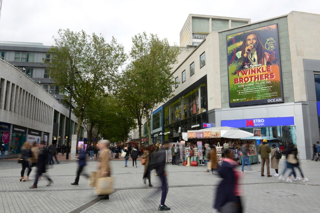
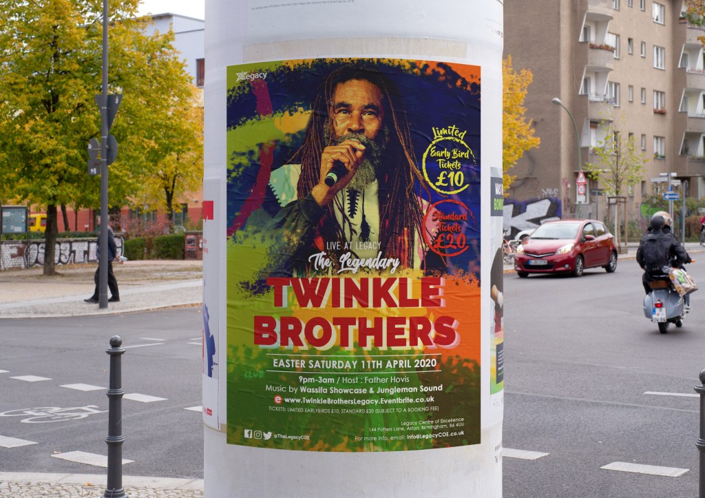
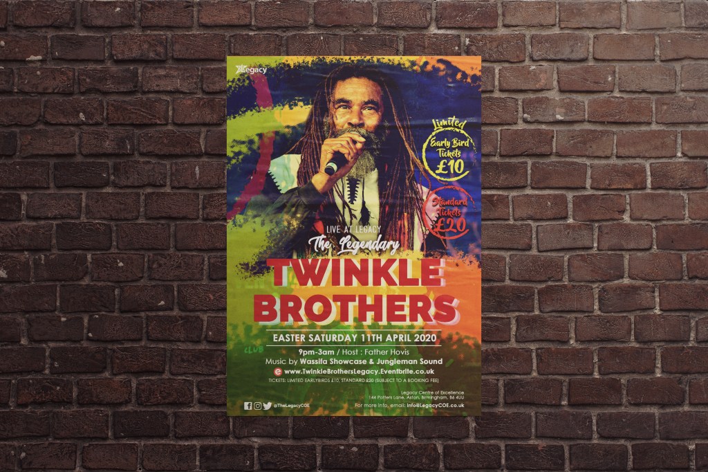
Design notes: The client has requested a reggae concert flyer that stands out from other event promotions, with a bold and vibrant aesthetic that accurately represents the genre. Please feel free to experiment with different colours, fonts, and graphic elements to achieve this goal. Make sure the design is visually appealing and easy to read at a distance, as it will be posted in various locations around the city.
How I met the Brief …
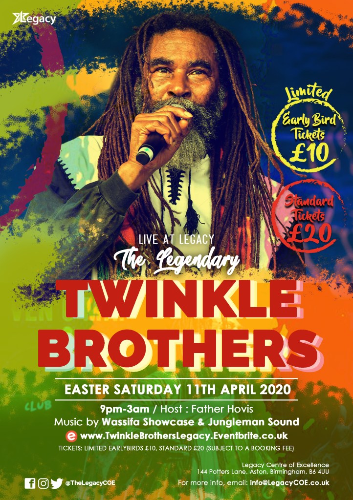
I tried to capture the required feelings by digitally hand drawing swooshes of spray paint, swooshes bring energy and a sense fun mimicking the motion of a hand wave which is part of the fun that you would find at a concert e.g hand waving and dancing.
Utilising vibrant earthy tones, to both bring energy, impact and a sense of relatable street art which is something that makes the flyer feel like it’s for ‘the people’, this mixed with the colours brings a real feeling of roots and reggae culture!
I then paired this with fonts that were bold Sans Serif (Raleway), to amplify the sense of boldness and legacy / age which was echoed further by the visual echoes behind this font. The visual echoes also helped the title to stand out further on such a colourful background. Using Raleway to bring the essence of age and legacy also helped the flyer to apply to the older side of the target audience.
I also used a calligraphic font, to amplify the sense of suave / smooth and fun island vibe, while also making the poster have more of a personal / human touch, this type of font would appeal more to the younger side of the target audience, along with the bold bright colours.
Once these elements had been solidified, I also used a large image of Norman Grant, the leader of the Twinkle brothers to bring one focal point to the poster, so that those who were already Twinkle Brothers fans, would be able to recognise straight away what was happening without them having the need to read any text. This would also insight people to read on to find out further information.
Below are some mockup examples of the poster being used around a city space…
