The Brief
Brand Name: Whe Network
Target Audience: Health-conscious women looking to lead a healthy lifestyle, physically, mentally and spiritually, from inside and outside of christianity.
Brand Personality: Modern, clean, feminine and sophisticated with a focus on natural and pure products.
Brand Stands for:
- Healing
- Recovery
- Reconciliation
- Restoration
- Empowerment.
Logo Usage: The logo will be used primarily on packaging, marketing materials, and the company’s website. It should be versatile enough to work in different sizes and formats, including both digital and print media.
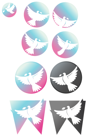
After sketching out a few ideas, the client decided that they wanted for me to head in the direction of a dove icon based logo. Above are some earlier concept examples…